
RGB color matching for paper tube packaging can be more challenging than many customers expect. Recently, we worked on a custom sealed paper canister project for a pet treat brand. The customer had three different designs, but one of them used an RGB color that was difficult to reproduce through conventional printing. We tried different CMYK combinations, explored Pantone spot colors, and eventually proposed an on-press ink adjustment to get closer to the original color. The final result wasn’t an exact match, but it was acceptable to the customer. Here’s how we handled the problem.
The Challenge: The Customer Wanted to Keep the Original RGB Color
This project was for custom sealed paper canisters used for pet treats. The customer had three designs prepared by their own designer, and everything seemed straightforward until we reviewed the artwork.
One of the designs contained an RGB color.
We explained that RGB is mainly used for digital displays, while printed paper tube packaging uses physical inks. Some RGB colors, especially bright and highly saturated ones, are outside the range that conventional printing can reproduce.
We suggested asking the original designer to adjust the artwork for printing. However, for various reasons, the customer decided not to go back to the designer.
They were willing to pay us to help adjust the color, but we decided to first explore some possible solutions and see how close we could get.
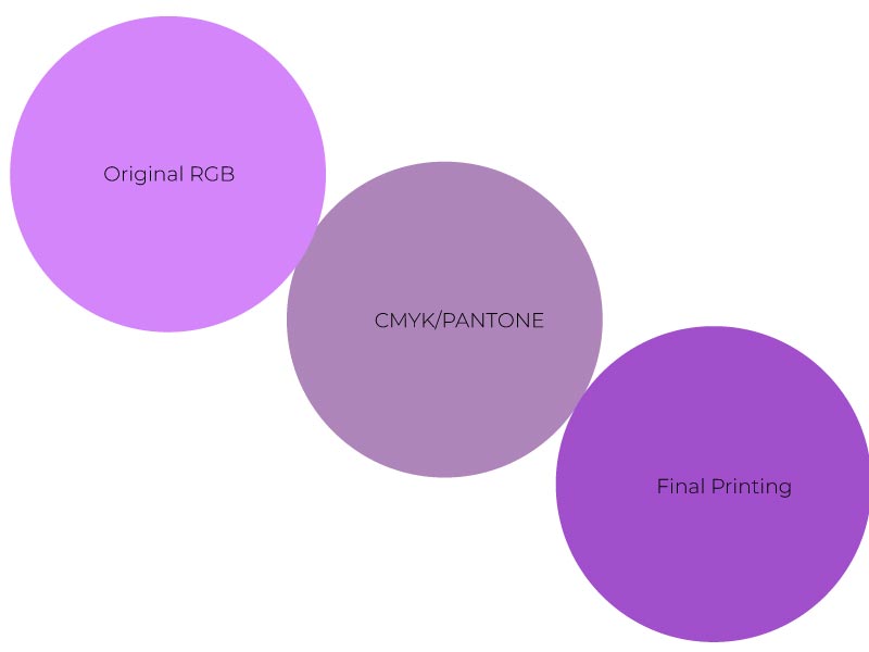
There was another important detail: the customer had already provided a CMYK version of the design. However, the converted color looked quite different from the original RGB color.
They weren’t happy with it and still wanted the original RGB appearance.
So, we decided to take a closer look rather than simply tell the customer that the color couldn’t be printed, we’re trying to get RGB color matching for paper tube packaging for our client.
Why RGB Colors Don’t Always Work for Paper Tube Printing
Before getting into our attempts, let’s look at why this happens.
RGB and CMYK use two different color systems.
RGB creates colors by combining red, green, and blue light on a screen. CMYK uses four printing inks — cyan, magenta, yellow, and black — to reproduce colors on paper.
The problem is that RGB can display a wider range of colors than standard CMYK printing can reproduce.
This means that when a design is converted from RGB to CMYK, some colors may lose their original brightness or saturation.
You may have noticed this with vivid pinks, purples, blues, or other highly saturated colors. They can look bright and attractive on a computer screen but appear duller or noticeably different when printed.
And switching to Pantone spot colors doesn’t automatically solve the problem. Pantone offers many premixed ink colors, but there isn’t an exact Pantone equivalent for every RGB color.
This is something worth considering before finalizing your paper tube packaging artwork, especially when a particular brand color is important.
How We Tried to Match the Original RGB Color
We didn’t want to stop after the first failed conversion. Instead, we explored different possibilities based on the actual printing requirements, hoping to get RGB color matching for paper tube packaging well.
1. First Attempt: Adjusting the CMYK Colors
Our first step was to test different CMYK combinations.
Since the customer had already supplied a CMYK version, we knew that simply using the converted file wasn’t going to meet their expectations.
We explored different color values, trying to find a combination that could retain more of the original color’s brightness and saturation.
However, none of the combinations we tested was close enough.
The limitation wasn’t simply that we hadn’t found the right CMYK numbers. The original RGB color was beyond the reproducible range of standard CMYK printing.
At this point, we realized that continuing to adjust the four ink values was unlikely to give us the result the customer wanted.
2. Second Attempt: Finding a Closer Pantone Color
Next, we moved on to Pantone spot colors.
We compared different Pantone references and looked for a suitable color that could serve as an alternative to the original RGB color.
Spot colors offer another way to approach color matching because the ink is premixed rather than built from four separate CMYK inks.
However, even after testing several Pantone options, we still couldn’t find a sufficiently close match.
This is something customers should understand: having a Pantone color reference doesn’t mean every digital color can be reproduced exactly.
We needed another approach.
3. Third Attempt: Adjusting the Ink During Press Proofing
After the CMYK and Pantone attempts, we proposed a different solution.
Instead of relying entirely on an existing Pantone color, we selected a relatively close Pantone reference as a starting point.
Our next step was to use an on-press proofing approach.
During the actual printing process, our printing technician would gradually adjust the ink and check the printed color along the way, trying to get RGB color matching for paper tube packaging to the customer’s original RGB reference.
This was different from simply changing color values in the artwork. We were working with the actual ink and printing conditions to explore what could be achieved.
Of course, this approach also had limitations. The final appearance depended on the ink, paper surface, printing conditions, and other production factors.
It wasn’t a guarantee that we could reproduce the original RGB color exactly, but it gave us another possibility to try.
The Final Result: Closer to the Original, but Not an Exact Match
After the on-press adjustments, we obtained a sample that was closer to the original RGB color.
Was it exactly the same as the design on the screen? No.
There was still a visible difference, but the customer found the final result acceptable.
For us, this was a useful experience. It showed that when a color cannot be reproduced through a straightforward conversion, there may still be other options worth exploring.
At the same time, we also learned that it’s important to set realistic expectations. Not every screen color can be reproduced perfectly on printed paper packaging, even with additional ink adjustments.
What Should You Check Before Printing Custom Paper Tube Packaging?
If you’re preparing artwork for custom paper tubes, especially when you have specific brand colors to maintain, here are a few things we recommend checking before production.
1. Use Print-Friendly Colors from the Beginning
If your packaging will be printed using conventional CMYK, it’s better to prepare the artwork with the printing process in mind.
You can still start your design with RGB, but don’t assume that the colors will remain unchanged when converted for printing.
It’s much easier to discuss color limitations with your packaging manufacturer before finalizing the artwork than to make major adjustments just before production.
2. Don’t Assume Pantone Can Match Every RGB Color
Pantone spot colors can be a good option when a specific brand color needs to be reproduced consistently.
However, there isn’t always a suitable Pantone match for every RGB color.
If your design contains a particularly bright or saturated color, ask your manufacturer to evaluate it before choosing a replacement.
3. Consider the Paper Material and Surface Finish
Color matching isn’t just about the ink.
The paper used for wrapping a paper tube can also affect how the final color looks.
For example, coated paper, kraft paper, and white paperboard have different surface characteristics. Matte or gloss lamination can also change the visual appearance of printed colors.
That’s why we always recommend evaluating important colors on the actual paper material and finish whenever possible.
4. Request a Physical Sample Before Mass Production
A color displayed on a computer screen is not a reliable reference for approving printed packaging.
If a particular brand color is important, request a physical proof and review it under consistent lighting conditions.
For projects with stricter color requirements, a spectrophotometer can also help measure the printed color and compare it with an agreed reference.
5. Agree on the Acceptable Color Difference
Sometimes, an exact match simply isn’t technically achievable.
Before mass production, it’s better to review the physical sample, discuss the remaining color difference, and agree on an acceptable result.
This helps avoid misunderstandings and unnecessary adjustments later.
Final Thoughts: Good Paper Tube Printing Starts Before Production
This pet treat paper canister project was a good reminder that printing isn’t always as simple as converting an RGB file into CMYK.
We tried different CMYK combinations, explored Pantone spot colors, and finally used on-press ink adjustments to get closer to the customer’s original design.
We didn’t achieve a perfect match, but we found a result the customer could accept.
For us, that’s an important part of custom paper tube manufacturing. Our job isn’t just to follow the artwork and produce the packaging. We also need to understand the printing limitations, explain what is technically possible, and help customers explore practical alternatives when problems come up.
If you already have a packaging design with specific brand colors, it’s always a good idea to discuss the printing requirements with your manufacturer before production.
At Allpapertube, we work with customers on custom paper tube structures, printing, materials, and finishes. If you’re unsure whether a particular color can be reproduced on your paper tube packaging, feel free to share your artwork with us. We’ll be happy to review it and discuss possible solutions.