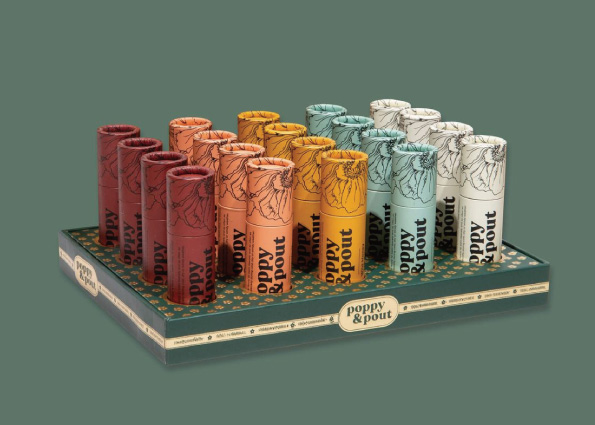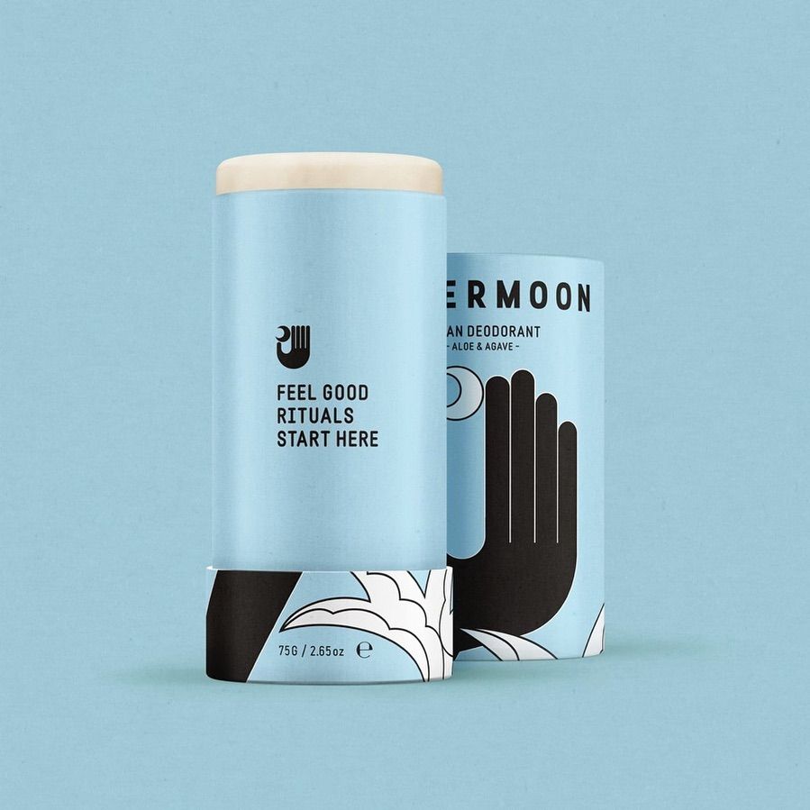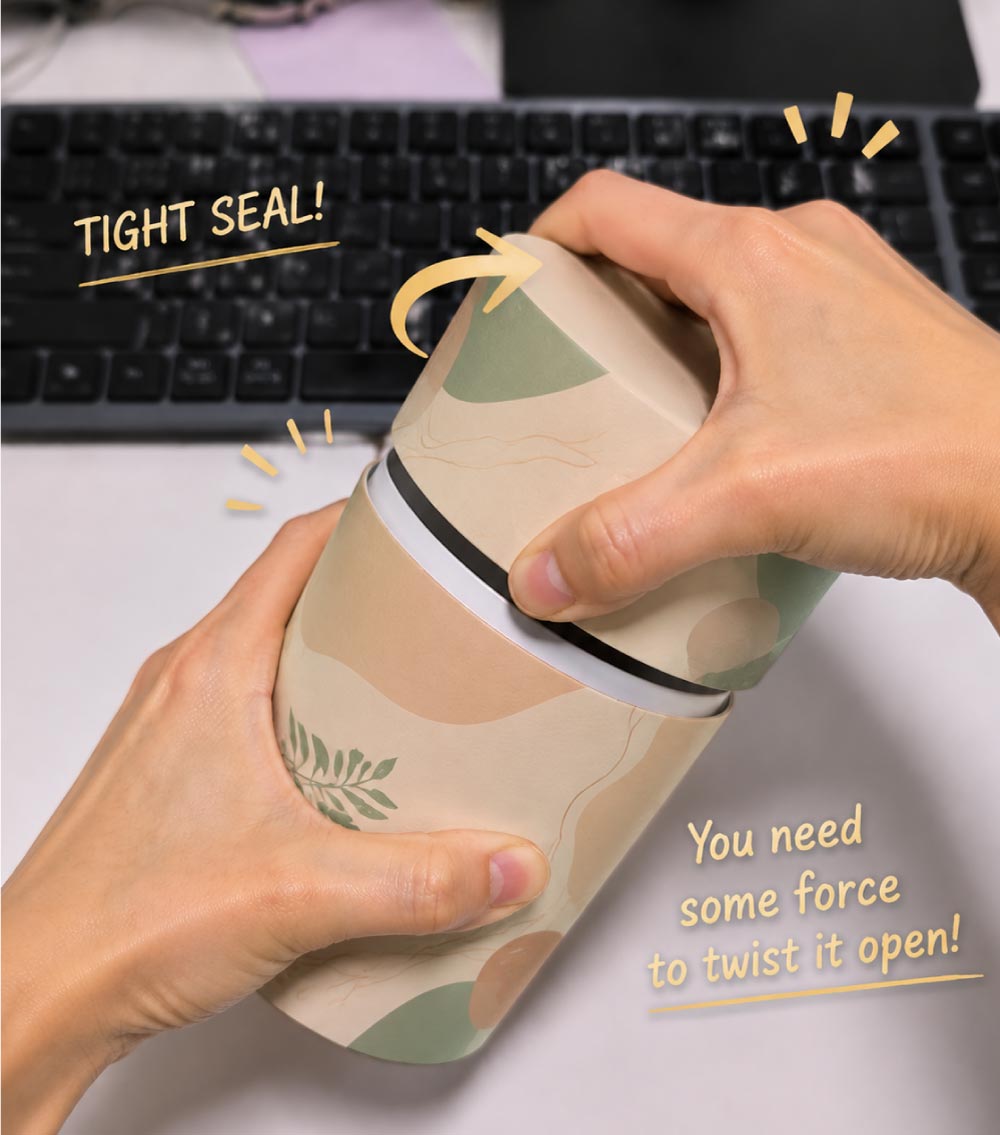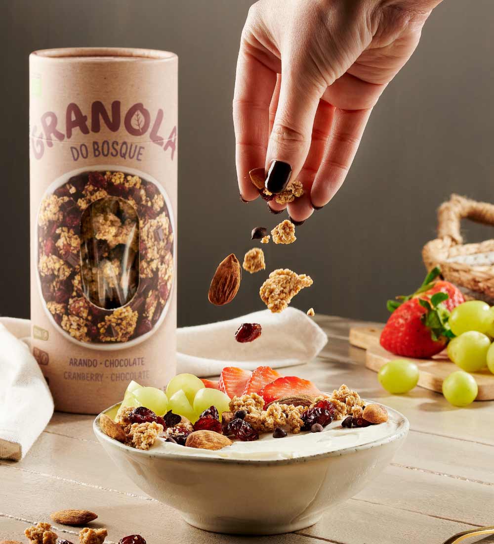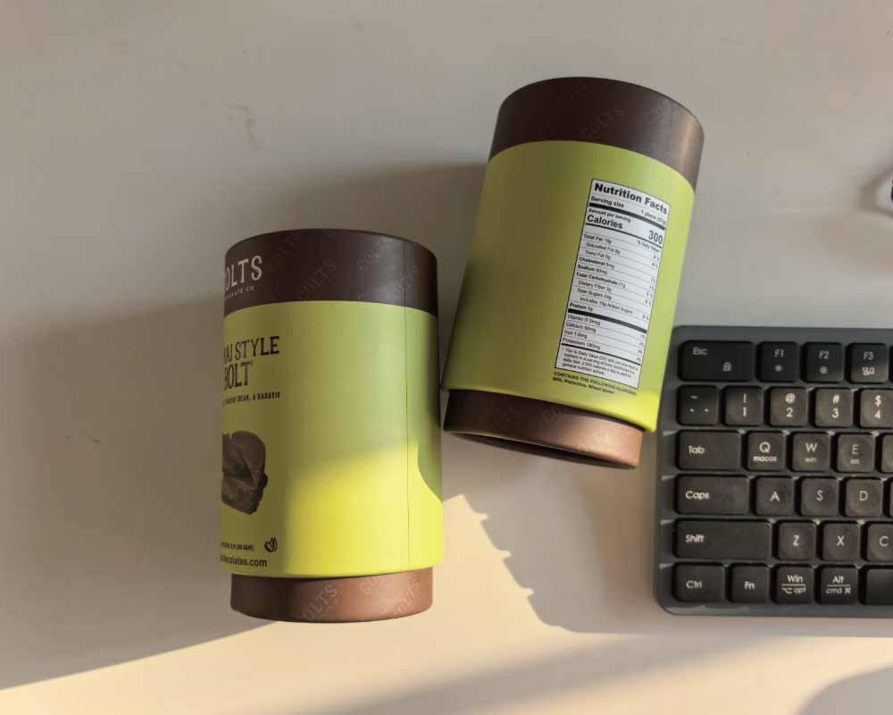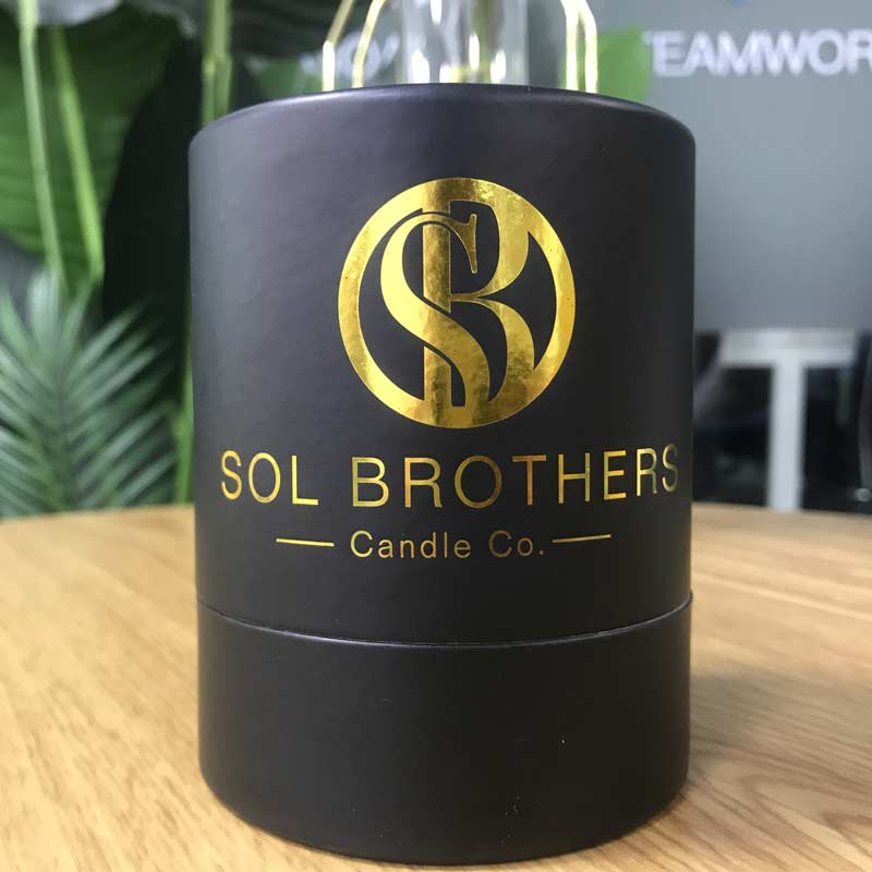

When brands develop custom paper tube packaging, it is common to have multiple SKUs with very similar layouts. The tube structure may stay the same, while the artwork, text, illustrations, or color combinations change slightly from one product to another.
This often leads to a question that comes up during repeat production:
“Why does the color look different between two production batches when the artwork has not changed?”
The first reaction is often to assume that something went wrong during production. In reality, batch-to-batch color variation is rarely caused by a single production mistake. In many cases, it is related to the printing method, the way multiple SKUs are arranged on the printing sheet, the choice between CMYK and Pantone spot colors, and the production conditions at the time of printing.
For brands managing multiple paper tube SKUs over the long term, understanding these factors is essential for maintaining paper tube printing color consistency while keeping production costs under control.
Why Do Multi-SKU Paper Tubes Develop Color Differences Between Batches?
We handle many custom paper tube orders involving multiple designs and repeated production. When a customer provides artwork without specifying a particular color standard, the industry generally treats the artwork as CMYK four-color printing.
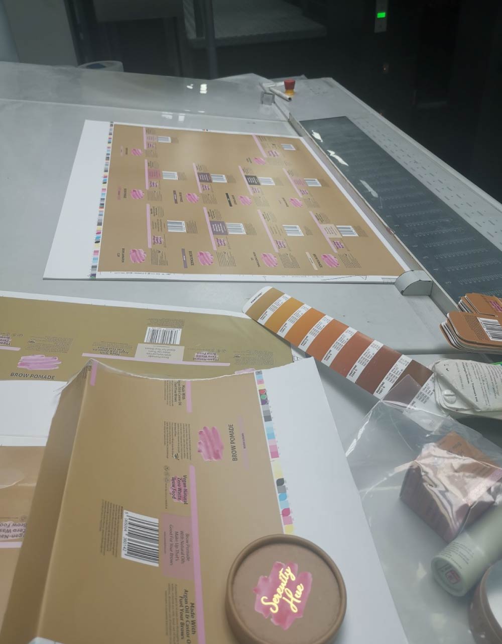
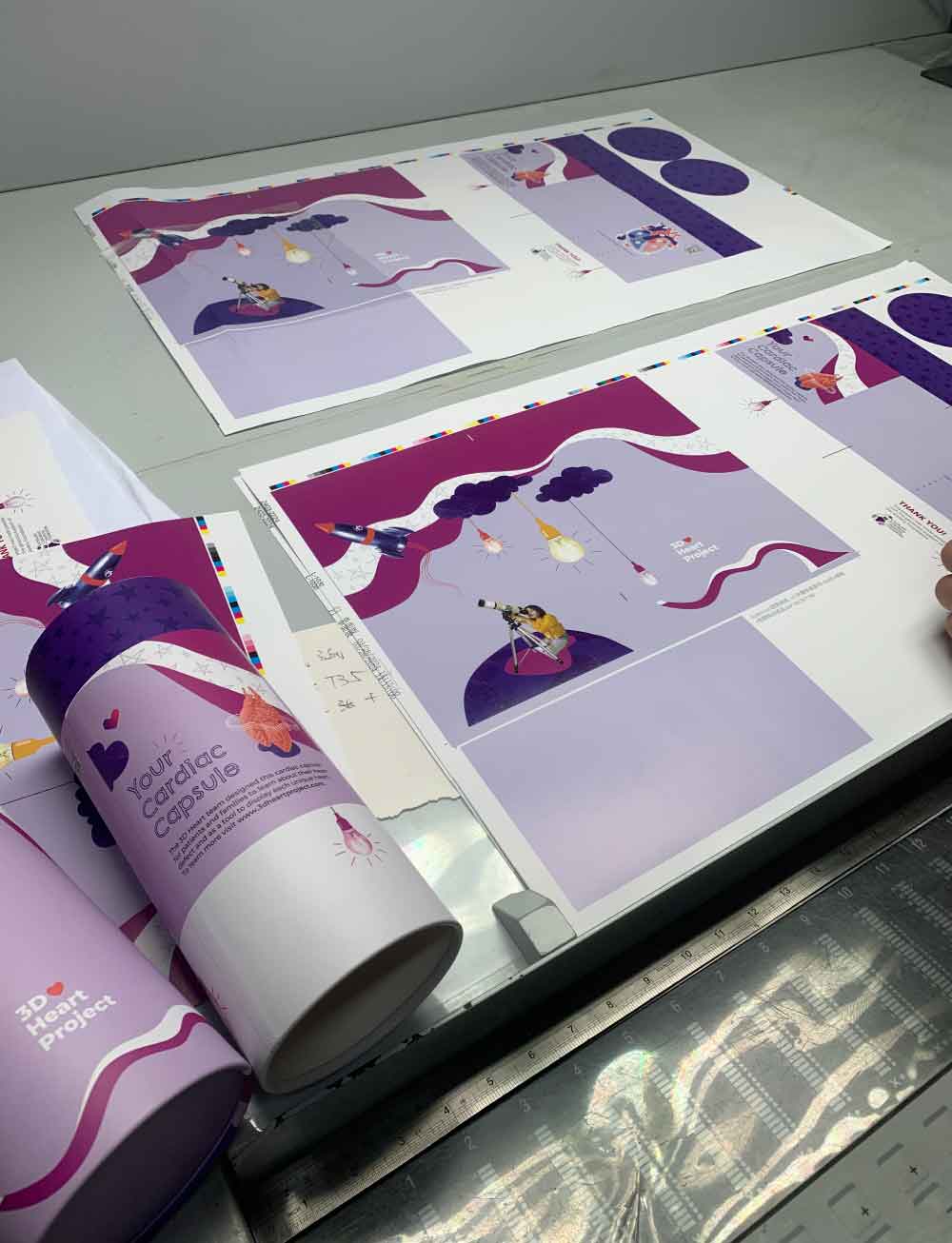
To keep setup and plate-making costs reasonable, paper tube manufacturers commonly use gang printing. Instead of printing each SKU separately, several different designs are combined onto the same large printing sheet and produced together.
This is an economical and practical approach, especially when individual SKU quantities are relatively small. However, it also has some limitations when it comes to long-term paper tube printing color consistency.
CMYK printing creates colors by combining cyan, magenta, yellow, and black through halftone dots. When a printing sheet contains several different designs, large color blocks, detailed graphics, and different image areas can affect the overall ink balance during production.
More importantly, the combination of SKUs on a gang-printing sheet may not be the same every time.
For example, one production batch may contain:
- SKU A with a large green background
- SKU B with a pale beige background
- SKU C with several dark illustrations
A later production batch may contain completely different designs.
Although SKU A itself has not changed, its printing environment on the sheet has changed. This can contribute to differences in the final printed color.
There are also normal variations associated with the printing process itself. Printing is a combination of mechanical and chemical processes, and factors such as machine cleaning, ink adjustment, production shifts, operator adjustments, and temperature or humidity can all influence the final result within a reasonable production range.
Large areas of light colors, pastel colors, and solid brand colors are usually the easiest areas for the human eye to notice.
For this reason, randomly mixing multiple SKUs for CMYK gang printing across separate production batches is one of the main factors affecting paper tube printing color consistency.
It is also important to set realistic expectations. No printing process can guarantee absolutely zero color difference between production batches. The practical goal is to control the variation within an acceptable range that is difficult for the human eye to distinguish and that meets the brand’s approved color standard.
Three Practical Solutions for Better Paper Tube Printing Color Consistency
There is no single printing solution that works for every brand. The right approach depends on your SKU quantity, order volume, budget, and how strictly you need to control brand colors.
For long-term multi-SKU paper tube packaging projects, we generally recommend three approaches, from the most economical to the highest level of color control.
Solution 1: Group Similar Colors Together for CMYK Gang Printing
This is the most economical option and is suitable for new products, smaller production runs, and brands that can accept a small amount of color variation.
Instead of randomly combining different designs on the same printing sheet, SKUs with similar main colors can be arranged together whenever possible.
For example, several products using similar green tones can be placed in one production batch, while products with completely different dominant colors can be arranged separately.
This does not eliminate color variation, but it can reduce unnecessary interference between very different designs and create more consistent printing conditions.
The biggest advantage is that the brand can continue to benefit from the cost efficiency of CMYK gang printing without adding separate Pantone plates.
For brands with multiple SKUs, we also recommend combining orders whenever possible instead of repeatedly placing small, separate orders.
Every time an order is produced separately, the gang-printing combination may change. Over time, this can increase the risk of visible color differences.
If your product demand allows it, producing several SKUs together is often a simple way to improve paper tube printing color consistency without significantly increasing the printing budget.
Solution 2: Use Pantone Spot Colors for Key Brand Colors and CMYK for Images
For most established brands, this is the approach we consider the best balance between color control and production cost.
The idea is simple:
Use Pantone spot colors for the important brand colors, while keeping CMYK printing for photographs, gradients, and complex graphics.
For example, a brand may have a specific green that appears across its logo, packaging background, and other marketing materials.
Instead of reproducing this green through CMYK, the brand can specify a Pantone color.
The logo and large areas of the key brand color are then printed using the specified Pantone spot color, while photographs and gradient artwork remain in CMYK.
This gives the brand much better control over its most important visual elements without requiring the entire design to be printed using spot colors.
It also helps maintain paper tube printing color consistency across different SKUs because the key brand color is no longer dependent entirely on CMYK dot combinations.
This approach is particularly suitable for brands that:
- Have established brand guidelines
- Produce multiple SKUs
- Place repeat orders
- Need consistent logo and background colors
- Want better color control without paying for a full set of spot-color plates
There is another long-term advantage.
If several SKUs use the same Pantone color, the same printing plate can often be reused for future production. This means the initial plate-making cost can be spread across multiple orders over time.
For brands with a growing product range, this can make the mixed Pantone + CMYK approach particularly cost-effective.
Solution 3: Use Pantone Spot Colors for All Key Colors
For premium product lines and brands with strict visual identity requirements, full spot-color printing provides the highest level of color control among these three options.
Instead of relying on CMYK combinations, the main colors are specified as individual Pantone spot colors. Each required spot color has its own printing plate and ink.
Because the ink is prepared as a specific color rather than being created by overlapping CMYK dots, the result is less dependent on the surrounding artwork.
This is especially useful when packaging has:
- Large solid-color backgrounds
- Strict brand color requirements
- Simple but highly recognizable designs
- Frequent repeat orders
- Strong requirements for visual consistency across SKUs
The main disadvantage is cost.
Each additional spot color generally requires its own plate and ink preparation, so the total setup cost increases as the number of colors increases.
However, for long-term repeat orders, the calculation can be different.
If several SKUs share the same Pantone colors, the same plates may be reused. For brands ordering regularly, this can make spot-color printing more economical over the entire product lifecycle than it may initially appear.
For high-end brands where color consistency is part of the brand experience, the additional investment may be worthwhile.

Four Practical Ways to Reduce Color Differences in Paper Tube Printing
Choosing the right printing method is only part of the solution. Good production planning and clear color standards are equally important.
1. Standardize the Artwork Before Production
When submitting artwork, clearly specify whether the colors should be printed as CMYK or Pantone spot colors.
If a Pantone color is required, provide the exact Pantone reference.
Do not use the appearance of a color on a computer or phone screen as the final color standard. Different screens have different brightness, color profiles, and display settings, so the same digital file can look noticeably different from one device to another.
If the artwork does not specify a particular color standard, the manufacturer will generally treat it as CMYK printing.
Establishing the color standard before production can prevent many misunderstandings later.
2. Keep an Approved Physical Sample
For brands with repeat paper tube orders, we strongly recommend keeping an approved physical sample.
Before mass production, both the customer and manufacturer can retain the approved sample as a reference.
When the next order is placed, the physical sample provides a much more useful reference for checking paper tube printing color consistency than the original digital artwork alone.
However, there is one important point to understand: even when production is compared against an approved sample, a small amount of variation between batches can still occur because printing conditions are never completely identical.
The purpose of the physical sample is to establish a clear and practical production standard, not to promise absolute zero variation.
3. Keep the Paper Material and Weight Consistent
The printing material itself can have a significant impact on the final color.
Different papers have different surface characteristics and ink absorption properties. Even when the same ink and printing settings are used, changing the paper can change how the final color appears.
For long-term repeat orders, we recommend keeping the following as consistent as possible:
- Paper material
- Paper weight
- Surface treatment
- Printing method
For example, if the original paper tube was produced using one specific coated paper, switching to another paper with a different surface during a later order may result in noticeable color differences.
Material consistency is therefore an important part of long-term paper tube printing color consistency.
4. Plan Production Instead of Ordering Every SKU Separately
Production planning is often overlooked, but it can have a major effect on color stability.
If a brand has ten SKUs but orders only one or two SKUs at a time, each production run may require a different gang-printing arrangement.
This means the printing environment changes repeatedly.
If possible, estimate your demand in advance and combine multiple SKUs into the same production schedule.
For brands that cannot receive all the finished products at once, another option is to produce a larger quantity and store the finished paper tubes for scheduled delivery.
This approach may reduce repeated setup and printing variation while allowing the brand to receive products according to its actual sales schedule.
Which Printing Method Is Right for Your Paper Tube Packaging?
There is no universal answer.
If you are launching a new product, have a limited budget, and can accept some color variation, CMYK gang printing with similar colors grouped together is usually the most economical choice.
If your brand has established visual guidelines and wants better consistency without significantly increasing the overall printing cost, we generally recommend Pantone spot colors for the core brand colors combined with CMYK for images and gradients.
If you are developing a premium product line and color consistency is extremely important, full Pantone spot-color printing provides the strongest level of control among these options.
The important thing is to choose the printing method before production rather than trying to correct color differences after the paper tubes have already been manufactured.
Final Thoughts
Color differences between batches of multi-SKU paper tube packaging are not necessarily a sign of a production mistake. In many cases, they are the result of the printing method, gang-printing arrangement, material differences, and production planning.
For brands with multiple SKUs, paper tube printing color consistency should be considered from the beginning of the packaging development process.
If budget is the priority, grouping similar colors together for CMYK gang printing is a practical solution.
If brand consistency is more important, using Pantone spot colors for key visual elements while retaining CMYK for complex graphics offers a good balance between cost and color control.
For premium brands with strict color requirements, using Pantone spot colors throughout the main artwork provides the highest level of consistency, although the initial printing setup cost will be higher.
Ultimately, successful paper tube printing is not simply about choosing CMYK or Pantone. It is about matching the printing method with your SKU structure, order volume, brand requirements, and long-term production plan.
If you are planning multiple paper tube SKUs, we can evaluate your SKU quantity and estimated order volume and help compare the cost and color-control differences between different printing options before production.